Learn how to add more colours to your website design.
If you find yourself in a situation where you have a company logo but little else, here are a few tips to help you create some complementary and supporting colours that you can use with your website or other digital or printed media.
I use a similar process when working with clients who can only supply me with a logo. Please visit my prices page to read more about my "Company logo design development" service.
What we will create
We will generate a set of colours for screens. Creating equivalents of these colours for printed materials is also possible, but we won't cover those steps in this article. I won't delve too deep into the specifics of this process. The purpose of this post is to help you generate relevant colours quickly. However, you can contact me anytime if you have questions.
So why do you need a colour palette?
It's practical to have a specific set of colours for your website. These colours can be used for various purposes, such as creating blog post header graphics, illustrations or icons on your website or colouring the heading fonts in customer emails. Using a consistent colour palette throughout your website will make your content more visually recognisable to viewers and help distinguish you from competitors.
Step 1 - Create a mood board
According to Google, a mood board or inspiration board is a group of images, illustrations and graphics arranged together to evoke or present a particular style or concept. Sounds technical, but it's not technical at all. It's simply a grid of images and colours you can use to create colours or help with design inspiration when working on design projects.
Using Pinterest
If you're looking for unique images, graphics, and illustrations on any subject, Pinterest is the place to be. To get started, log in to your account or create a new one - it's completely free. Once you're in, create a new secret board and add images that catch your eye and relate in some way to your business or brand design. Don't just focus on colour - consider the subject matter and how the images work together. Choosing images that will appeal to your ideal customer is also important. Don't worry if this sounds complicated - trust your instincts and have fun. There's no right or wrong way to do it!
To find similar images on Pinterest, click on the icon in the bottom right corner of the image you are currently viewing. This will provide visually similar results, allowing you to choose from a broader range of images for your boards.
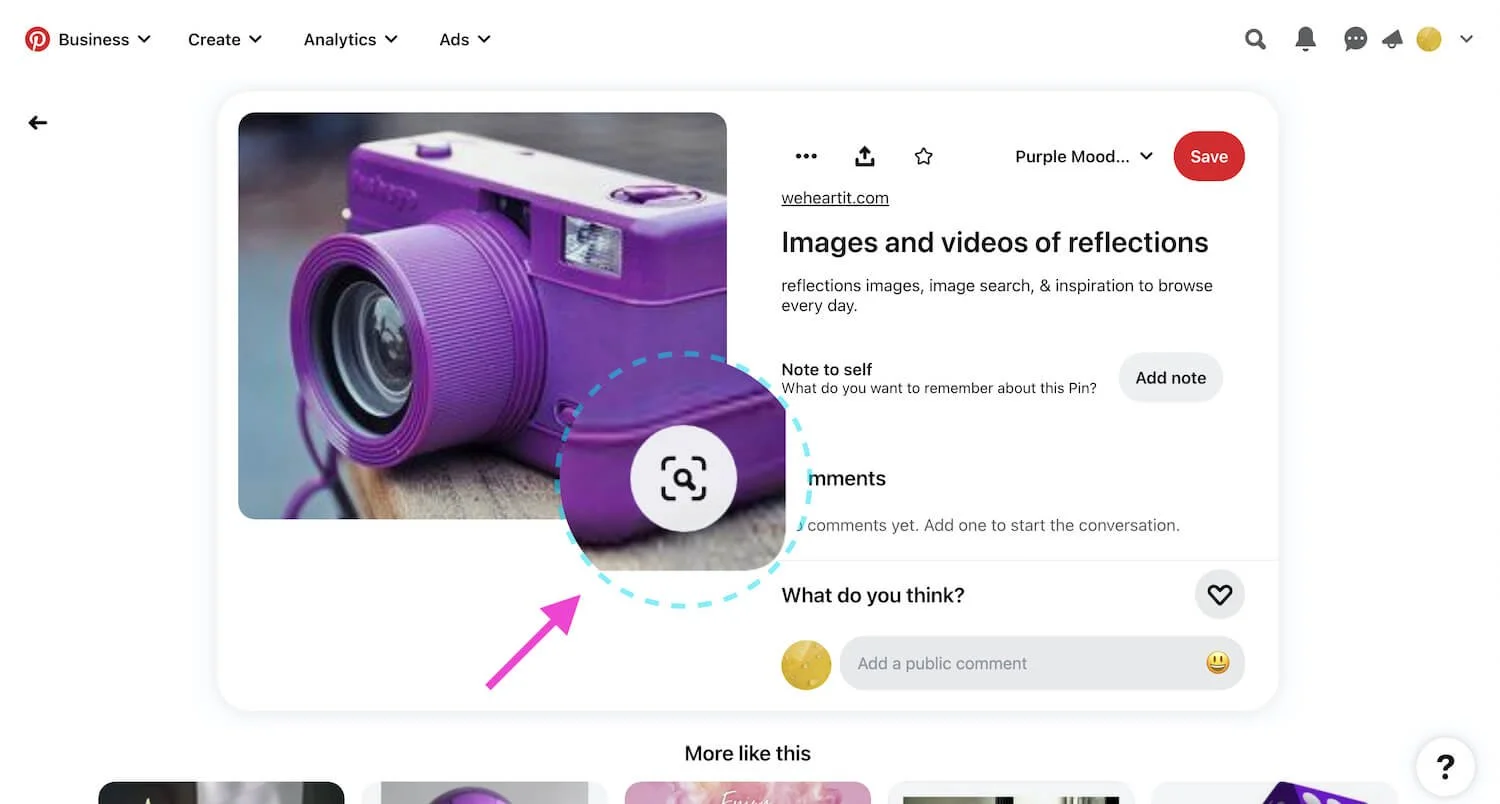
To discover similar images, click the button in the bottom right corner of the image you are currently viewing.
Making your mood board
Download images to your local computer, select the ones you like and store them in a designated folder to stay organised. In my example below, I pretended to be working with a logo for a company in the food sector with lots of purple colour in the logo design. These are the images I chose to download:


Now take all these images and position the ones you feel work well together in a grid-like structure to look like the example below.
Company logo
When creating your grid, if you have one, including your company logo in one area is a good idea. This will ensure that your images complement your logo and look visually pleasing. When selecting images, consider the subject, style, and colour. Avoid using images with logos and instead, opt for photographs or illustrations. I haven't added a logo in the example below as it is only an example board, and I don't have one.
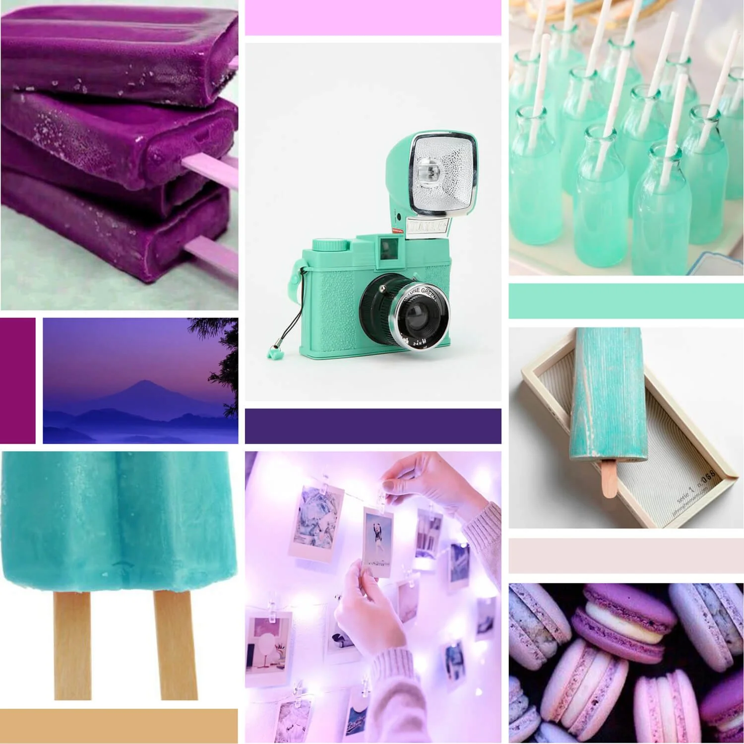
Example of a mood board made with images for Pinterest. Take note of the solid colour blocks that are incorporated into the grid.
It may take some time to get right as it's like forming an image-based jigsaw puzzle but stick with it. Pull together pictures of similar tone, subject, structure and colour. Experiment with different combinations of pictures; swap out images that are not working for something else. If you run out of images, head back to Pinterest and use that "find similar images" button to find some alternatives. Also, in the mood board above, there are not just images but solid blocks of colour too. Try to leave the same amount of whitespace between each image or block of colour.
You can search for mood boards online to get inspiration and layout ideas. But make sure you don't get too swayed by what you see. Your mood board should reflect your customer's preferences, not someone else's.
How to use software tools to make your board
The method you use to create your mood board depends on the software you can access and feel comfortable using. I prefer Adobe InDesign because it allows me to easily adjust the size and position of my images. However, other options include Adobe Illustrator or Photoshop, Sketch, Affinity Designer, Photo or Publisher. Even Microsoft Word, Excel or PowerPoint can be used if you are familiar with these programs.
Additionally, various online applications like Canva are available, and a quick Google search will reveal other software options.
Ultimately, the application you use is not important. What matters is your ability to arrange and structure your images to create a final mood board, which can be easily achieved using the most commonly used desktop applications.
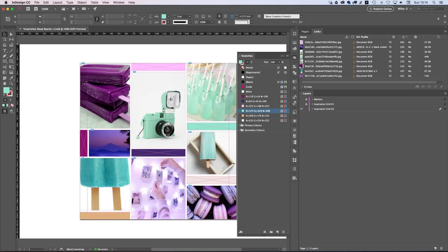
Adobe InDesign makes it very easy to position your images and colour blocks.
Making colour blocks
I use the eyedropper tool in InDesign to sample colours directly from the pictures to create solid blocks of colour for my mood board. I place these blocks amongst the images where they look best and work well with the overall design of the board. Building blocks of colour this way is an essential step and will help you create your final set of colours.
A short video showing the Adobe InDesign eyedropper tool in action.
If you don't have an eyedropper tool
Check to see if the application you are using has an eyedropper tool you can use. If you don't have an eyedropper tool or equivalent within your chosen application, try drawing a simple block or shape using your application's native tools to which you can add a solid colour. Move this block or shape and position it close to the portion of the image where you would like to sample the colour. Using your application's colour tools, try filling that block with a solid colour and matching that solid colour to the colour of the portion of the image you like. You can likely access a colour wheel within your application giving you access to the full range of RGB colours which will help you to match the colour accurately. Once you have the colour or are close to it, you can move the block back into position on your grid layout.
Make some alternative versions
With your images placed and spaced and some colour blocks made, you should now have a complete mood board. Make a few versions with different layouts, images and colour blocks to see what results you get.
Step 2 - Creating your website colours
Create up to six colours to start with. Less if you like. Most brand identity designs use minimal colours. Think of Coke; it's just red! So, keep things simple.
Consider incorporating primary and secondary colours into your palette as you develop a brand identity design. Although they can be useful, this is not always necessary. Take your time, and feel free to add them if they fit your design. Remember, simplicity is key!
If you have a company logo
If you have a logo for your business, I suggest you repeat the same process but include your current logo in your mood boards. Select images that work well together and also work well with your logo in regards to colour, tone and subject.
Step 3 - Making a swatch list
After selecting the colours, it is recommended to create a separate document listing the RGB values of each colour for easy reference. To do this, use your preferred application to create a swatch list like the one below. The list should display each colour and its corresponding RGB and Hex values. You may need to locate an area in your application where you can record all of the colour values. In InDesign, you can double-click on a colour in the swatches panel to access the various colour values and then jot them down or save them in a file for future use.
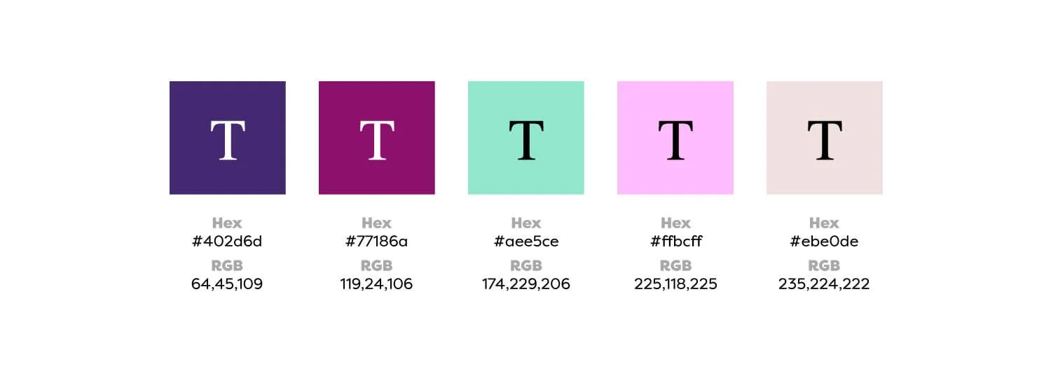
A swatch list of the colours in my mood board.
Making adjustments to colours
It's important to remember that the mood board is only there to guide you. Don't hesitate to make adjustments to the colours as needed. If you find yourself straying too far from your original colour scheme, it may be helpful to return to your original board and start again.
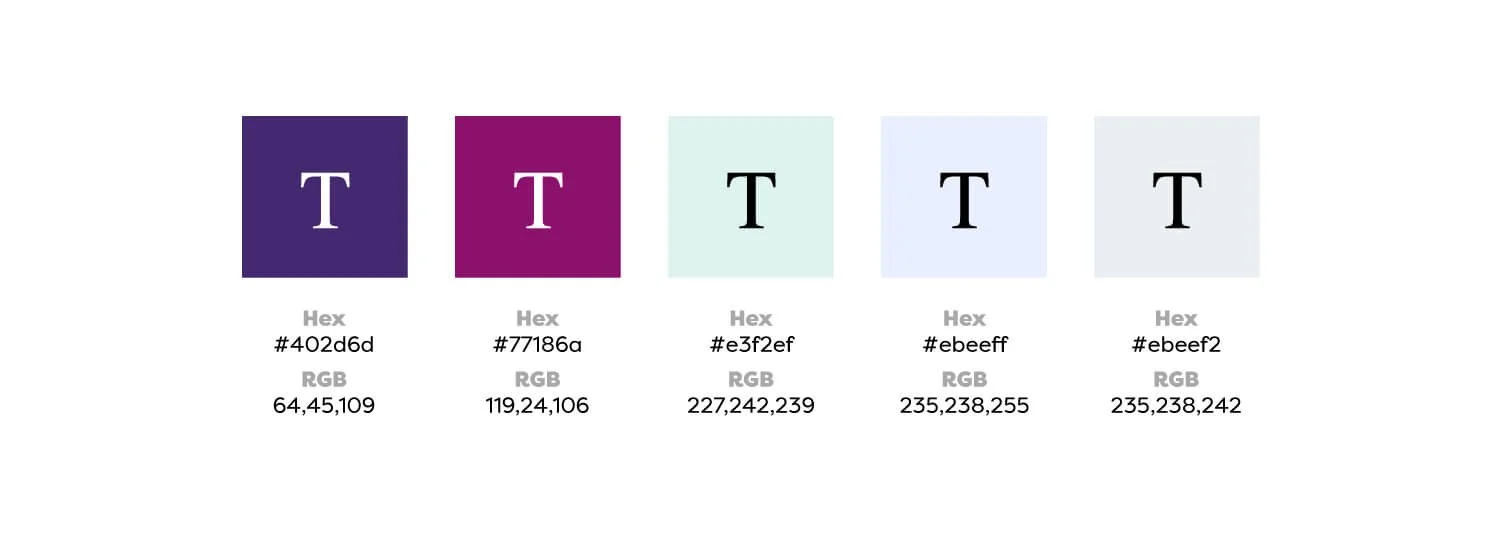
A swatch list of the colours I have tweaked.
One last thing worth mentioning again!
When creating the mood board, consider the photographic or illustrative styles when choosing imagery in relation to your logo if you have one already. Doing this helps you choose photographic or illustrative styles that complement your logo and help you develop a brand identity. Also, if you decide to hire a professional photographer or illustrator at any point, you can share your mood board with them to serve as a style guide.
Final thoughts
Try creating your colour scheme to give your website a unique look. You can experiment with various sizes and shapes of mood boards to find what works best for you. No hard and fast rules exist, so let your creativity run wild! Once you've settled on a colour scheme, use it consistently across all your marketing materials to give your brand a professional and recognisable look.
Creating colours is one of my favourite design processes, so I hope you have fun making your colours. I wish you all the best of luck with creating amazing colour palettes.
Let me know if you found this post helpful, and please feel free to contact me if you have any questions.